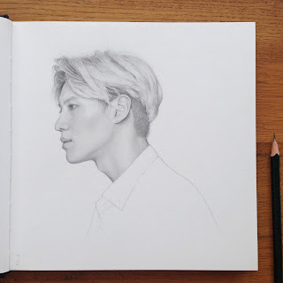
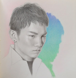
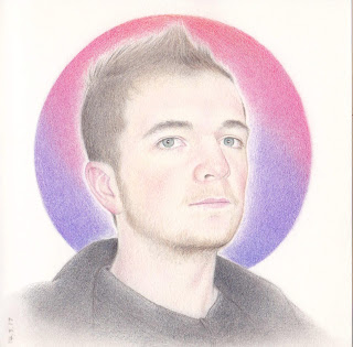
Friday, June 19, 2009

Jenson Button (2)


Although I admit doing more than one drawing of the same subject is a bit of an easy option, it is a very interesting exercise - perhaps not for the viewer but certainly the artist! Like the first portrait, this one is done in my square Paperchase book with the unforgiving paper. This time though, the paper didn't just break up, a little chunk came off, right on the tip of his cap, leaving a little trench! I'm tempting fate to keep using it, but part of me enjoys the challenge!

Unlike the last portrait, I gave some new pencils a try -Derwent Artists. And very nice they are too. They have some lovely shades suitable for skin tones and one of them, 'Mahogony' is a really gorgeous warm brick red and just the tiniest bit redder than my favourite Venetian Red. They go on very well but I still used some of the usual Lyras and Luminance Black and White for the lightest and darkest areas.

Wednesday, June 10, 2009

Jenson Button


I know from experience I can procrastinate for a very long time over a drawing I'm not enjoying so rather than put off the Yorkie drawing, I got on with this one instead. Jenson Button is looking almost certain to become the next Formula One world champion. I haven't switched allegiance, I'm still rooting for Lewis Hamilton, but I just liked the angle of his face here.

This was done on the first page of my new square format brown sketchbook (photo here) and if anything the paper is even more unforgiving than the smaller Paperchase ones I've been using. The surface breaks up so easily it's almost impossible to erase anything once the colour is down. Normally I try out a couple of colours in the background but this time I had to stick with the blue. He's this year's 'blue eyed boy' so I guess it's appropriate.

The face is mostly Lyra Rembrandt Medium Flesh and Venetian Red with Luminance White for the highlights and a lot of Polychromos Burnt Ochre too. Initially I started this and put it away for a day but when I came back to it it looked so pale and insipid I got the Venetian Red and really scrubbed it on and it improved instantly. I used a Luminance Black for the darkest areas as that covers really well. Real F1 fans will notice the cap isn't right but I wanted to keep that as simple as possible.

Thursday, May 28, 2009

Yorkie WIP


A drawing I have on the go at the moment. It's actually the same Yorkie I drew here, but always wanted to know how I'd go about it in colour. Since I put the Feedjit traffic meter on the blog I've been surprised to see that most of my hits come from people Googling 'how to draw a Yorkie'. Since no-one has left a comment I'm still left wondering if this is a drawing challange or competition.

Anyway, it prompted me to try this little dog again as I like the photo so much. However, I'm not keen on drawing hair and fur so I'm now putting this away for a little while. I'm feeling a bit frazzled from keeping up the blog and keeping up with everyone else's blogs and feel it's time to slow the tempo down a bit - I can't give up reading blogs completely so I have to be realistic! I've decided to return to another creative love of mine and do a little quilting (see my other blog) while I recharge my batteries.

Sunday, May 10, 2009

Julia Sawahla (3)


The third of the three Julia Sawahla portraits. The colours are, again, similar to the other portraits but last time I used no Light Carmine, and this time I used much more. I used Light and Medium Flesh (Lyra) as usual to build up the base of the skin tones, adding Luminance White to put in the lightest highlights. There is quite a bit of Polychromos Light Sepia in the darker areas and the face, and again, that lovely warm glow of Burnt Ochre (Polychromos). Venetian Red (Lyra) is the one I use for adding shade and there is Magenta and Sepia in there too. It looked a little flat but the Light Carmine really brought it to life. Around the eyes I've used Magenta, Purple Violet (both Polychromos) and Warm Slate Grey (Lyra) to create a cool contrast with all the warm tones. I used a Jakar battery powered eraser to bring out some highlights and strands (after putting down Sepia, Burnt Ochre, Venetian Red and Black) and then emphasising highlights with a White Luminance pencil.

For the hat I tried Vermillion (Polychromos) - a gorgeous orangey red - but it looked a little flat. However, adding Light Carmine on top, in loose circular squiggles, and letting the two reds show made it much more vibrant and brought out the knitted texture. Finally I added just a hint of white around the edges in the background.

I made a video - just a short snippet - of this drawing in progress here on my other blog.

Wednesday, May 06, 2009

Julia Sawahla (2)


Julia Sawahla again. I'm really inspired by her colouring as orange, purple and green is perhaps my favourite colour combination. The oranges and golds in her hair and skin look wonderful with green and purple, so I added these to the clothes and background. The exact shade of her eyes is quite hard to match but I used a touch of green and grey. I used many of the same colours as in my last portrait except for the Carmine red - I added Venetian Red and Magenta for her lip colour instead - and used Luminance black instead of Polychromos as it seems to give a better saturation.

Saturday, April 25, 2009

Julia Sawahla


The finished portrait. (Check previous post for the work in progress.) I'm happy with this and again, like the Lewis Hamilton portrait, I'm more concerned that it's a good drawing rather than a good likeness although I think this one is closer!


It was the light that inspired me here and the warm glow it cast, but I do think she is very beautiful and as I seem to mainly draw men, it made a pleasant change!

Julia Sawahla - WIP

I thought it would be fun to post another work in progress but this time right from the beginning. I've taken photos rather than scans as this is much quicker for me (my new-ish laptop doesn't work with the old scanner) but hopefully the quality is good enough to see the details and colours. Normally I write words under the photos I'm describing but after I publish I seem to have huge gaps between the words and photos and I haven't been able to sort that out. So, the first stage, below, is where I've done the outline and indicated the lightest lights with a white Luminance pencil and the eyelashes and pupils with black. The graphite outline will smudge and grey the colours so I rub it out just enough so I can see it and then replace it with the relevant colour, in this case I indicated the hair in brown.


Next I used Polychromos Light Flesh to indicate the next lightest value and blend in with the white.


Next, Light and Medium Flesh all over and then blending it with a tissue wrapped around my finger. This takes off most of it but leaves a residue in the paper to build on again so this process might be repeated a couple of times. It makes a nice smooth base to build on. Although I must say it tends to work better on white paper than this very smooth brown stuff.


The colours look too pink and the face inspired me because it has such a wonderful warm orange glow, so I try out other colours. I don't have a plan, I just see how things look and take them off with a tissue if I don't like them. Here I'm trying Cinnamon and I think Burnt Ochre Lyra pencils and indicating some darks in the hair with Light Sepia (Polychromos). I put some of the warm tones in the hair too so hopefully it will create a glow later.


Building up layers of skin tone, restating some highlights. Using some Venetian red, one of my favourite skin tone colours, to tone down the pink and deepen the shadows.


This Polychromos Burnt Ochre pencil is quite soft so I put a layer over the whole face and into the hair to give it a nice warm glow.


Out comes the black - that always makes a huge difference but I have to resist the urge to use it too soon! It's used very lightly here in the face but more heavily to create the hairline. I put more Venitian Red in the skin around the temples and use it to blur the edge of the hairline - and blend it into the hair too. Constant layering of the other colours already used with the addition of some Light Carmine on the lips. Another favourite colour Warm Slate Grey (Lyra) added around the jawline and a touch under the eyes.


One colour always 'makes' the portrait and it's different every time, I'm always looking out for it. Here it was Burnt Ochre but I also discovered a great effect when I used the Light Sepia pencil on it's side and put down a layer. It seemed to have a messy hair effect and as I had worried how I was going to do the hair, I decided when I saw this to keep it very sketchy and loose. Overall, I'm really pleased with this - I just wish I had this paper in a larger size as this is crammed into a tiny 6"x8" sketchbook!


When I tried blending that brown, it almost smudged right off. In fact, the pencils act more like pastels on this paper, but it's an effect I quite like. In the finished drawing, I used a touch of Apple Green and Emerald green in her clothes and Sky Blue (all Lyra) for the background (see next post).

Sunday, April 12, 2009

Lewis Hamilton


Well almost. The eyes are not quite right but it was enjoyable to do nonetheless. I tried so many colours I can't remember the names of them all but I wanted to bring out some pink tones so I started with Medium Flesh (Polychromos) to put in the lightest colours first and built up the skin tones with various light browns and even some green and blue along the chin and jaw. I wanted the shadow on his forehead to glow so there is quite a bit of Light Carmine there and around the eyes. With every colour pencil drawing, I find there is always one colour that really makes it pop and I didn't find that colour until it was almost finished - that was Caput Mortuum (Polychromos).

Unfortunately, this brown paper doesn't scan well at all so the subtle shades are completely lost. It looks very flat compared to the original and as the brown paper hasn't even scanned as the correct colour I don't think there is any way around that. Again, close but not quite!

Monday, March 23, 2009

Self portrait


I have it on very good authority (Alex!) that this looks nothing like me. (It's a mirror image, that's my excuse!) Just as well really as this is me feeling quite unwell and I think it shows. Having recently had two bouts of migraine with an attack of sinusitis in between I'm hoping that's all behind me now. I'm not sure why I wanted to do a self portrait but maybe to remind myself to stick to my anti-migraine diet, no matter how tedious and boring it might be!


After the first migraine, I switched to a diet high in fruit and started taking these probiotic drinks hoping that might help but instead had a dramatically negative effect! (Blogged about here.) So, two drawings to remind me of a not so wonderful time, but at least they got me drawing again. I find these (colour pencil on brown paper) very satisfying to do as they are so quick and I can scribble and build it up using very loose strokes - they don't show on this paper. The only problem is (or maybe it's a good thing) the paper doesn't take very much abuse before the surface breaks up so little or no erasing and fussing is possible. The migraines break up the flow so these are perfect for a quick fix and getting my momentum going again.

I've used a white Caran d'Ache Luminance pencil here for the first time as the Lyra and Polychromos white pencils aren't opaque or strong enough to really show up well on the brown paper.

Tuesday, March 03, 2009

Zoe Wanamaker


Drawn from a BBC programme called Who Do You Think You Are, tracing celebrities family histories. It's a very interesting progamme but equally interesting this week were the lovely glasses and some of the clothes Zoe was wearing! (I'm wondering where she got a chocolate brown suede jacket - I've been looking for something just like it for years!) I knew I had to draw those black and white spotted glasses and that red cardi though!

Of course, to do colour I need to press pause but it's still not that easy - I have to have a whole tin of pencils in front of me so I have everything to hand. Once I got the pencil sketch done though, it was surprisingly quick - by my standards of course! There is something about the name of the pencils called Light and Medium Flesh (by Lyra) that puts me off using them as if it's 'painting by numbers' but Light Flesh worked perfectly here for the skin and I just added some red and purple on the left side for warm and shadow. The skin colour on the hands were very lightly indicated with quick touches of the same colours and a light touch of black in the shadows. Her hair was amazingly quick with White, Ivory, Yellow Ochre (Polychromos) for the light areas first and simply adding shading around those lines with a warm brown. I find it much easier to do the light areas in the hair first rather than having to leave them and work around them as I do with graphite. The lines look much more natural and flowing this way too.

The paper is by Paperchase and although it's the colour of brown wrapping paper, this particular shade is very hard to find in sketchbooks. This was done in the 6"x8" version but I'd like to see a larger version and for them to get rid of the oversized spirals that eats up space and makes it hard to scan.

Saturday, February 21, 2009

Art Blog Award


I rarely get blog awards but as four very kind bloggers awarded me this one, I was pretty amazed! I'm very honoured so thanks go to

Teresa at Blueberries Art & Life
Grahame N Butler
Spinnereta at Jacobite Rose
Christine at Creative Life Studio

I have to list 7 things I love. Making a list always makes my mind go blank so it took a while to come up with something and not repeat things I've said before. And I should say, this excludes the obvious - family, health, chocolate, art materials etc.!

1. This was easy, cats! Chocolate brown Burmese or Siamese, I can't decide which, but I do love cats. They are so elegant, beautiful and completely mad, which is a great combination, I think!

2. Also brown and beautiful - Black Lemurs. I've always been drawn to Madagascar and it was a really amazing to visit a reserve on the island of Nosy Komba and have them jump on my arm for a banana! I can still feel those soft little fingers today!

3. Holidaying in West Cork as a child. It was such a thrill to drive to the beach along deserted county roads on a warm August day. Just before we'd arrive I'd look up at the fluffy white clouds over the hills and think of the fun we'd have on the beach just beyond. There is something about the clouds where sea meets land that still gives me a thrill. I'd hate to go back there now as it would probably ruin the memory!

4. Shopping in London. Going to Cork was an escape from London, but after so many years, on and off, of living in other countries, I think of London as home. I love shopping trips there - there really is nowhere better, it has the best food (it's a myth the French have better food - and anyway, it can be bought in London!), the best art shops, the most choices for books, shoes, clothes and anything else you can think of (Alex discovered the guitar shops in Denmark Street last year!). There is so much to see and do there and I've only done a fraction of it!

5. Colour. It's been a long journey, using colour the way I want to. I used to love combining colours in paint as a child and seeing how they looked next to each other. Somewhere along the line I stopped playing but strangely enough it was going to a colour consultant in my 30's (as a birthday present!) and seeing the colours that suited me that was a major turning point. I really was stunned for days! It was like being given permission to play again!

6.Precision in nature. While others see chaos, I see precision - in the way petals fit together, in the precise shading on feathers, patterning on fish scales or chameleon skin, for instance. One of my first memories is of looking at the petals of a lupin and marvelling at how precisely the changes in size of each one to make the perfect whole (not to mention the prefect gradation in shading from top to bottom). From spinning atoms to spinning planets, I don't think any of it is chaotic.

7. Music. I was a young teenager in the mid 70's which was a really exciting time so music has always been an important backdrop. I thought I'd eventually grow up and start liking classical music but it hasn't happened yet!

Sunday, February 15, 2009

And now for something completely different!


The idea of using pen has been perculating for a while but I've always tended to focus exclusively on one medium at a time. It's only in the last year, perhaps longer, that I feel ready to try out other things at the same time. I guess it comes from getting to a certain level I felt happy with in graphite - I didn't feel I needed to push it any further which freed me to try colour. Now I've been doing colour for a year, I think I need the buzz of doing something completely different again but this time together with the sketching and other things. I don't feel at all confident with my lines when I use pen, so I may not post everything I do, but I have an idea to fill up this little Japanese Moleskine with only lines. I'm just going to see what happens - maybe some colour will go in, maybe it won't! This is the view of my sitting room looking down on it from the stairs. Eventually I want to make my lines more wobbly, less exact and push the perspective a little.

I used a Copic Multi Liner, size 0.05.

Thursday, February 12, 2009

Paul and Alex


Paul and Alex, drawn from two photos. Paul looked better in one and Alex the other and I've been meaning for a while to try putting them together to see if it would work. The main problem was that the two original photos were so small. They were taken in Dubai around 1996/7 and the light was really good coming in the window, I liked how it reflected on their faces.

Monday, January 26, 2009

Face from the cloisonné factory


The owner of the Chinese dog I nicknamed 'the little emperor', guarding the cloisonné factory just outside Beijing. It was good to get away from the grey faces of the Forbidden City and also to use colours in the clothes that complimented the skin tones! I used the usual combination of colours in the skin- Light Yellow Ochre and Venetian Red for the base layers - but also a lot of Polychromos Burnt Ochre in this man's skin to give it a warmer glow. Then over that I tried to show how weathered and leathery his skin was. although I have to say this is really only 90% finished. Last week was so stressful (mentioned on my other blog) that I really just hadn't the energy to finish it properly. The wrinkles on the forehead need a little softening, the chin made slightly less angular, the neck more shading and the jacket less sketchy. But overall I like it as it looks close to a sort of drawing style I like and not too photo realistic. It's probably the first drawing I've done where I've actually enjoyed doing the wrinkles too!

Saturday, January 17, 2009

Face at the Fobidden City


Finally, it's finished. In my last post I scanned it at the stage I enjoy most - with just the face - because after that it's just decoration and I get impatient to finish up! There are a few things about this that I'm not happy with but I'm keen to do something else now and I want to call it done.

I used a combination of Polychromos Burnt Carmine and Scarlet Red on the cap. It was actually much brighter in the photo but I felt that would overpower the face and the Burnt Carmine went better with the skin tones. I used Black to shade. I didn't have the right blue for the jacket so it's made up of layers of Polychromos Cold Grey and (Faber Castell) Albrecht Durer Dark Indigo. I try to avoid using the Albrecht Durer pencils as they are watersoluble but I didn't have anything close in the Polychromos of Lyras. There is a barely noticable background of Polychromos Sky Blue just because I felt like it - you'd probably never see a blue sky in Beijing! I'm not sure who these men were wearing red caps at the Forbidden City but they looked as if they were there to keep an eye on everyone.