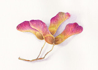
Sycamore seeds
I spotted these seeds on the ground by our post box a few days ago. I was really struck by the colours but also the fact that I'd never noticed how beautiful they were before now. How did I not notice for the last couple of years?!
I seem to gravitate more towards my little palette of Senneliers when I'm painting plants. It's a botanical set that I saw Billy Showell writing about in a magazine and available from Artifolk (here). I've squeezed them into pans and have them in a little palette so I've found them very convenient. I particularly like their Sap Green (I also like Schmincke's Sap Green too), Cadmium Red Light and Cadmium Yellow Light, they mix and handle so well. I used Carmine Genuine from this set with a little Manganese Violet to darken the edges and enhance the pink. There is a touch of Cadmuim Yellow Orange to warm up the yellow areas - a very light wash - and Winsor & Newton Sepia for the darker brown areas.
The shadow gave me the greatest trouble - as usual! - as it has to be smooth and fade out. That takes a bit of experience and for me at the moment, that's a bit hit and miss. I used Neutral Tint (W&N) which stains, mixed with a touch of Manganese Violet and it was a bit blotchy. I should really go for non-staining colours and mix to suit rather than go for that 'one size fits all' tint!
I haven't had any problems with the Moleskine watercolour paper before, but I did notice a tiny area where I'd pulled out some colour took off some of the surface and it reacted like blotting paper. I guess it doesn't withstand too much abuse, something to remember in the future because I do like this paper.


Comments
Another beautiful piece! You've really bought out the colour wonderfully yet it's still subtle. I've started using Senneliers much more too and you are right they seem really good for botanical work.
I hope you'll continue with some more!
Great job on these!