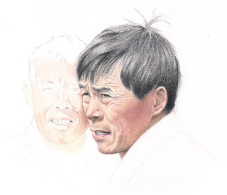
Forbidden City faces - work in progress
Teresa asked about my technique so I thought I'd scan the drawing I was working on and see if I could explain. I'm still feel fairly new to colour pencils so I don't have a technique as such. Certainly not compared to my graphite pencil work where I can visualise what I want the result to be and know how to get there and how long it will take me. With colour pencils I'm still learning as I go along so with each drawing I'm trying out different colour combinations to get the results I want. There is no set plan so I might try out a colour to see how it looks and if it doesn't work I'll erase it (as much as that's possible).

With this drawing, the face on the right interested me most but I liked the face behind too. The photo was taken from a distance so the man behind looks closer than he really was and I was curious to see if I could make that work in a drawing. In retrospect, perhaps it wasn't a great idea but it was worth a try! So, anyway, at this stage I had started the face on the right with layers of Light Yellow Ochre and Venetian Red to get the base skin tone. I built up the shady areas with Sanguine and Venetian Red then defined with Warm Slate Grey. It looked quite pale still so on the shady part of the cheek I added some Magenta and Burnt Carmine. I don't have a particular order, I'll just overlay what I feel it needs. Some yellow was 'washed' over it all to brighten it up and make it glow and more grey and red to deepen. Black is used lightly to really define thngs like nostrils, eyes, and the darkest shadows. Black was used for his hair and then a little Sepia at the front and some Light Ultramarine in the highlights.

For the man behind, I decided to use Burnt Ochre and Warm Slate Grey to build up the base tones. With graphite I start the eyes first but with colour pencil I leave those so the skin colours are kept clean but also to work out exactly where the eyes are (I have trouble placing eyes!) relative to the rest of the face because I can't erase back to pure white once I've made a mark.

He had a pale grey look about him that I tried to exaggerate but he had a glow around the jaw so I added some Light Yellow Ochre and Sanguine. I should mention that I also use tortillons ocassionally, especially for softening lines, and I use tissues folded around the end of my finger to soften, smudge and deepen colours - it makes a big difference.

I always find with colour pencils that everything looks quite saturated as I work on it but when I look at it the next day it's as if there is a milky film over the top. I'm sure it can't be wax bloom but it does seem odd. Yesterday he looked at if he was behind the man on the right, but today I look at it and he looks ill - like Keith Richards! I tried out a touch of Burnt Carmine on the cheek but I didn't want to put too much colour on it. Sanguine, Cinnamon and Burnt Ochre are added to warm up and define and -one of my favourites - Magenta. His hair is kept simple - just Black - and his clothes are kept very grey and light - a hint of Burnt Carmine in the collar and a hint of Raw Umber for the jumper darkened again with Black.

The finished result. I used a tissue to smudge the black in the clothes and fade it out. It's not quite as good as I'd hoped but as another sketch in my China sketchbook, it's fine. I started putting my China sketches in a large Winsor & Newton sketchbook but there are so many empty pages I thought I should try and put some more drawings in it!
I used mostly Polychromos pencils here but the Warm Slate Grey that I find invaluable is Lyra. I erase with a Jakar battery operated eraser also a Tuff Stuff 'eraser stick'.
What I love about these faces outside the Forbidden City is that all their teeth are bad, the haircuts are terrible, they all wear black or grey and three of the four I've drawn have warts on their faces ! I wish now I had pointed my camera at a few more of them - who knows what treasures I've missed!

With this drawing, the face on the right interested me most but I liked the face behind too. The photo was taken from a distance so the man behind looks closer than he really was and I was curious to see if I could make that work in a drawing. In retrospect, perhaps it wasn't a great idea but it was worth a try! So, anyway, at this stage I had started the face on the right with layers of Light Yellow Ochre and Venetian Red to get the base skin tone. I built up the shady areas with Sanguine and Venetian Red then defined with Warm Slate Grey. It looked quite pale still so on the shady part of the cheek I added some Magenta and Burnt Carmine. I don't have a particular order, I'll just overlay what I feel it needs. Some yellow was 'washed' over it all to brighten it up and make it glow and more grey and red to deepen. Black is used lightly to really define thngs like nostrils, eyes, and the darkest shadows. Black was used for his hair and then a little Sepia at the front and some Light Ultramarine in the highlights.

For the man behind, I decided to use Burnt Ochre and Warm Slate Grey to build up the base tones. With graphite I start the eyes first but with colour pencil I leave those so the skin colours are kept clean but also to work out exactly where the eyes are (I have trouble placing eyes!) relative to the rest of the face because I can't erase back to pure white once I've made a mark.

He had a pale grey look about him that I tried to exaggerate but he had a glow around the jaw so I added some Light Yellow Ochre and Sanguine. I should mention that I also use tortillons ocassionally, especially for softening lines, and I use tissues folded around the end of my finger to soften, smudge and deepen colours - it makes a big difference.

I always find with colour pencils that everything looks quite saturated as I work on it but when I look at it the next day it's as if there is a milky film over the top. I'm sure it can't be wax bloom but it does seem odd. Yesterday he looked at if he was behind the man on the right, but today I look at it and he looks ill - like Keith Richards! I tried out a touch of Burnt Carmine on the cheek but I didn't want to put too much colour on it. Sanguine, Cinnamon and Burnt Ochre are added to warm up and define and -one of my favourites - Magenta. His hair is kept simple - just Black - and his clothes are kept very grey and light - a hint of Burnt Carmine in the collar and a hint of Raw Umber for the jumper darkened again with Black.

The finished result. I used a tissue to smudge the black in the clothes and fade it out. It's not quite as good as I'd hoped but as another sketch in my China sketchbook, it's fine. I started putting my China sketches in a large Winsor & Newton sketchbook but there are so many empty pages I thought I should try and put some more drawings in it!
I used mostly Polychromos pencils here but the Warm Slate Grey that I find invaluable is Lyra. I erase with a Jakar battery operated eraser also a Tuff Stuff 'eraser stick'.
What I love about these faces outside the Forbidden City is that all their teeth are bad, the haircuts are terrible, they all wear black or grey and three of the four I've drawn have warts on their faces ! I wish now I had pointed my camera at a few more of them - who knows what treasures I've missed!


Comments
Thank you again!
Teresa, thanks, I'm so glad it's useful. I tried to keep it relatively simple, it's mostly focussed on colours, so if there is anything you want to ask, please feel free!
Congratulations on making it to Katherine Tyrrell's short list! Your portrait of your brother is wonderful!
The 'forbidden city faces' is wonderful too. I love how you have captured their expressions.
I was intrigued to read of the milky film you saw on your work. Yes, as Polychromos pencils are oil based it couldn't be wax bloom. I wonder what could be causing this effect?
You mentioned how you erased coloured pencil. Have you tried lifting the pigment? I especially like lifting pigment when I have several layers applied to the paper. I use masking tape (a painter's tape variety as it has less tack) and I also use transparent tape. I would suggest testing this method on your favourite papers. It works great on Stonehenge.
Anyway, congratulations again and best of luck!
w.
Lindsay, I have to pinch myself, I don't know why it just clicked and why I struggled before!
Teresa, have fun with the new pencils! Try a tortillon too for the smaller areas, it's a similar effect.
Hi Teresa M, thanks and welcome! I think the milky effect is just my imagination - I work to get the colours more saturated and perhaps looking at it after a break reveals the truth! Thanks for the tip, I'll try the tape!
Wendy, I'd love to be able to sketch more quickly!